Sea Trash Scrimshaw
Thursday, August 31st, 2023
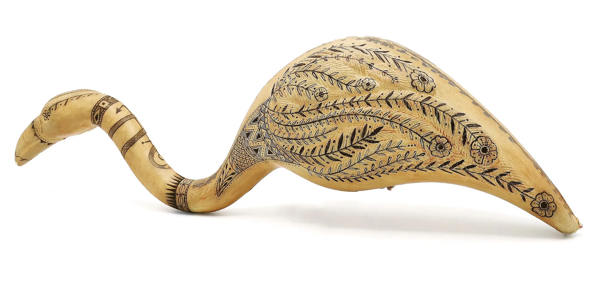
Artist Duke Riley makes scrimshaw-inspired art on plastic sea garbage. For the uninitiated, Scrimshaw are ink-engraved bones most commonly made by sailors. Thanks, Lily!
Artist Duke Riley makes scrimshaw-inspired art on plastic sea garbage. For the uninitiated, Scrimshaw are ink-engraved bones most commonly made by sailors. Thanks, Lily!
Incessantly curious Montrealer Trevor Kjorlien, aka Plateau Astro, has a scale model of the earth and the moon on his front-yard fence. His photo of it from his Patreon looks like this:
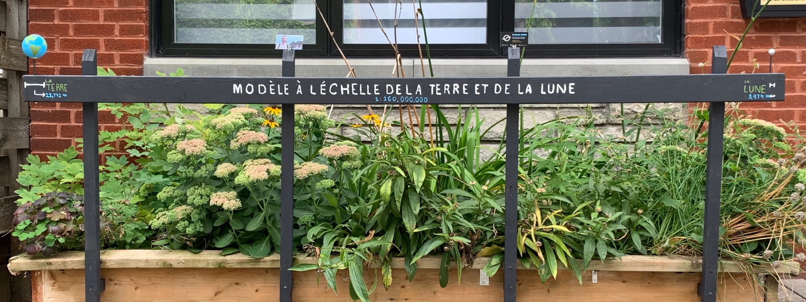
This is a great little guerrilla educational tool already, but, he says it leads to a common question: “How big is the Sun? Where is it?”.
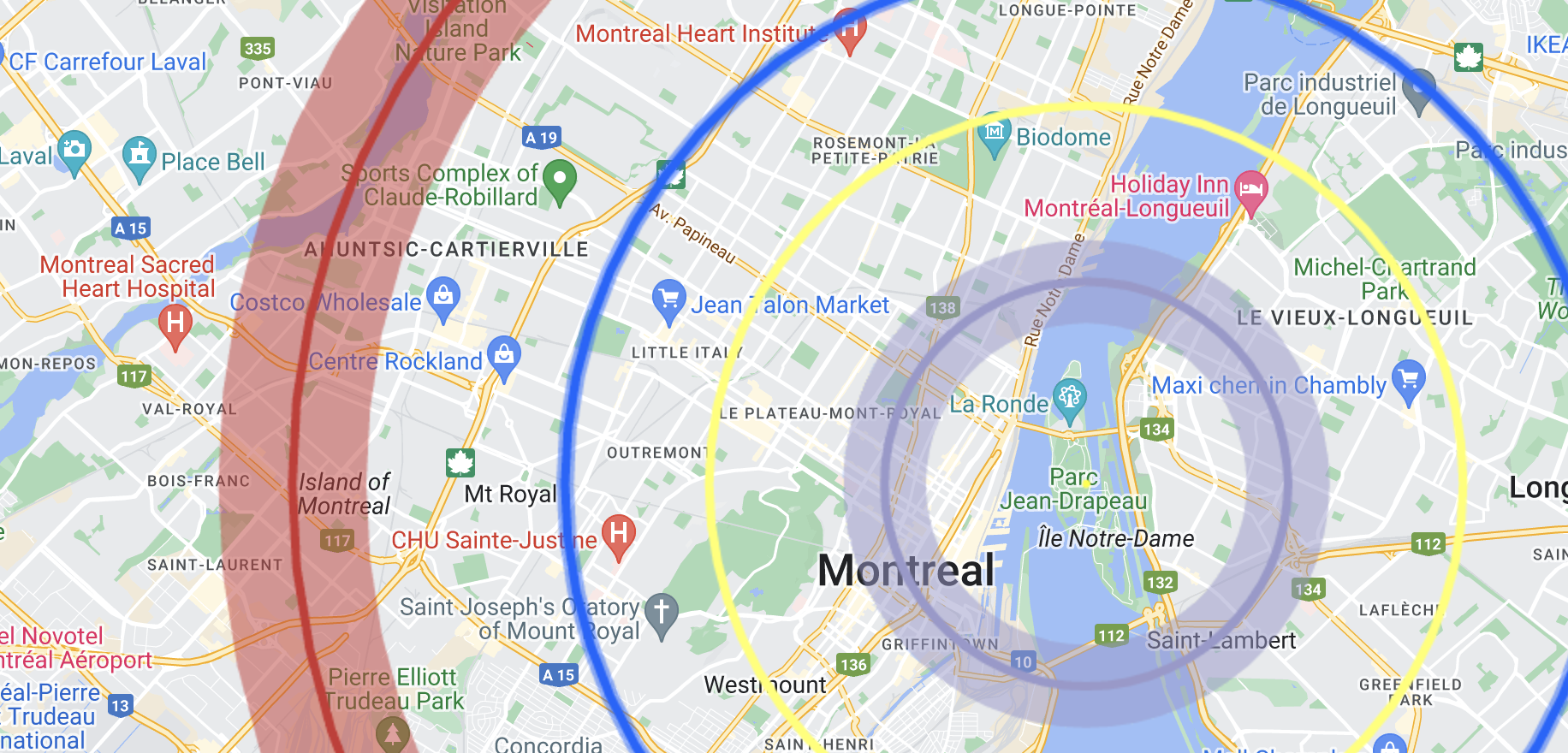
This prompted me to contact him and ask if Montréal’s own Buckminster Fuller-designed geodesic dome, formerly the Expo 67 American Pavilion and now ‘The Biosphere’, would make a suitable sun. Not at the scale of his front-yard models, it turns out. At his front-yard scale, the sun would be about 6 meters across, and about 900 meters away from his tiny earth. The Bucky-ball would be a lot larger than his front yard would allow, at a 76 meter-diameter.
Trevor then sent me a map made with the aptly-named Solar System Scale Model Calculator with the 76-metre Biosphere at its sun, and the results are fascinating, largely because by scaling to a known size, it makes it clear just how utterly empty the solar system actually is.
It’s also satisfying to zoom in and see the solar system scaled onto something more familiar to people, like a city (click to explore):
I also feel obligated, when mentioning the Biosphere taking the place of a star, to also mention that the biosphere was once covered in clear plastic panels, which caught fire in maybe the most heavy metal way.
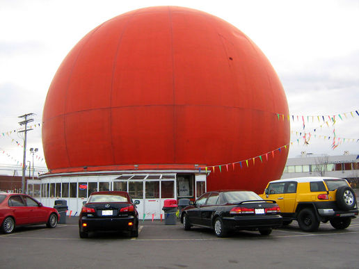
Which brings us to the other obvious sun substitute in Montréal, the rather sunny-looking Orange Julep. At 12 meters across, the Orange Julep is about exactly double the size the sun would be compared to his front-yard earth and moon, and also too far away. He was nice enough to generate a map of the solar system scaled to the Orange Julep sun.
Visit Plateau Astro for much more fun space content.
Friend of Elsewhat Sean Micheals has a great piece about AI and its relation to art up in The Baffler. Sean has an impending novel which explores the use of AI to create poetry. His years of writing the book, and his use of AI to help write it gives him a unique perspective on a topic that is generating a lot of discussion. Here he discusses how AI are being pitched to be large scale generalists:
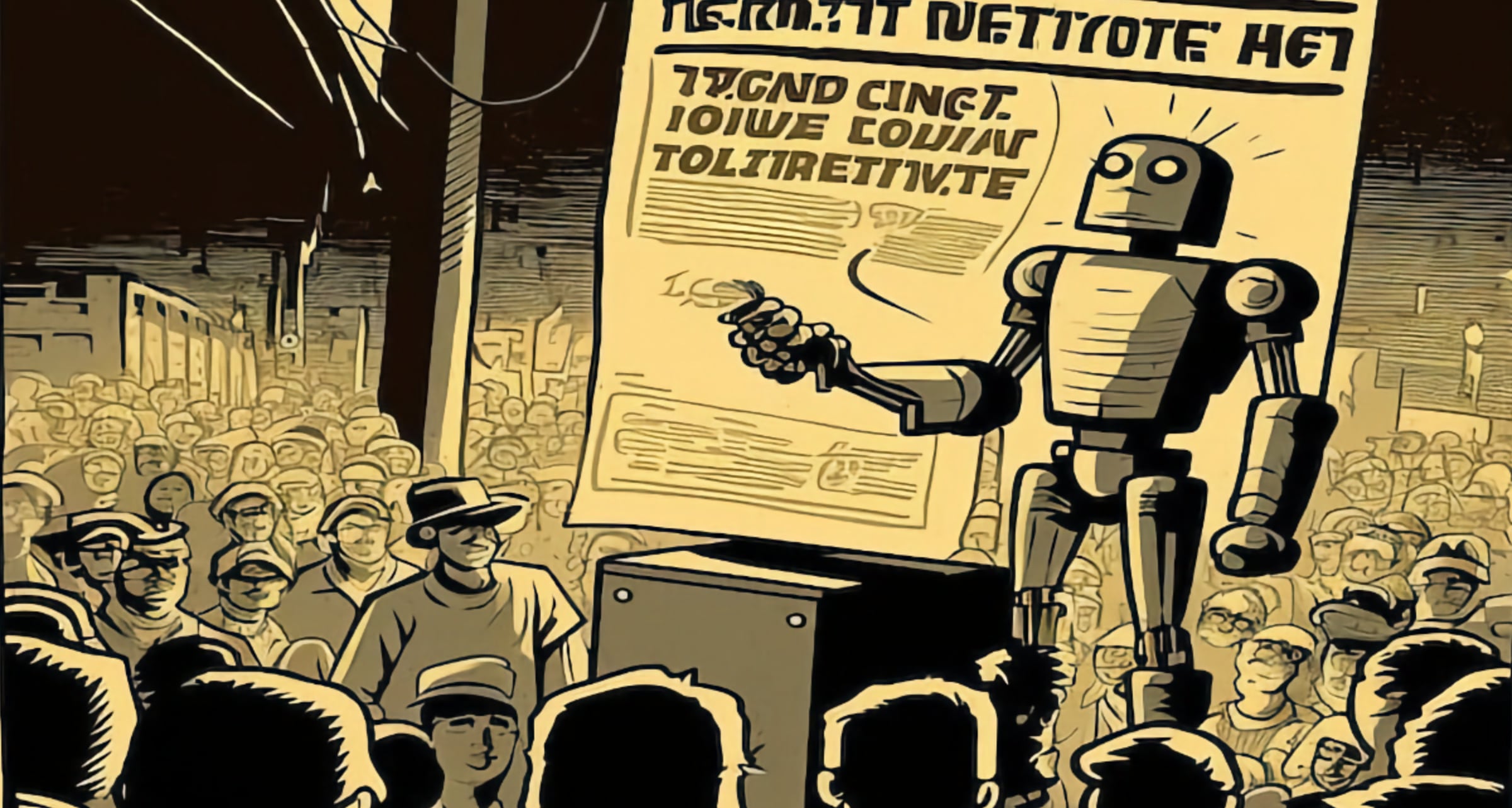
So far, we have been bamboozled by big AI companies into assuming that we want big AI. Products like ChatGPT prioritize authority over personality, predictability over innovation; the same is true even of tools like Notion and Sudowrite, which are directly aimed at writers. All the major stakeholders seem focused on one-size-fits-all solutions, rather than developing tools that allow ordinary people to imagine original, artificial minds—trying out different architectures, applying different training data, embracing glitches, hunches, and obsession.
This idea of AI being monolithic and authoritative is not intrinsically part of the technology. I’m already seeing many smaller uses of AI pop up in my daily life. I used ML to enlarge the image above, and often use AI to identify plants and mushrooms using photos taken on my phone.
Here he describes how AI, when not trying to be authoritative and reliable, can actually generate surprising (and maybe poetic?) results. He describes their use of a ‘temperature’ setting, which can be used to set how ‘out there’ the LLM’s results are:
Platforms like Bard, Bing, and ChatGPT have their default temperature set relatively low: it’s more important to be “normal” and accurate than interesting. But other AI tools allow users to specify the temperature, increasing the likelihood that they will make the wrong—or inventive—choice. Years ago, I asked an LLM to finish a sentence that began “The rose’s color was . . .” With the temperature turned down, it only ever answered “red”—or, perhaps, “a vibrant shade of crimson.” When I dialed up the temperature, the system’s tenor changed. “The rose’s color,” it wrote, “was affected by the blade.”

In light of recent talk about AI potentially displacing human jobs, this recent podcast episode from Cautionary Tales about Ned Ludd (source of the term ‘Luddite’, and a completely made-up person) feels topical. The luddites were not unaware or ignorant of technology, as luddites are often presented today, they were a labour movement trying to protect skilled jobs. And they were willing to use violence to do it.
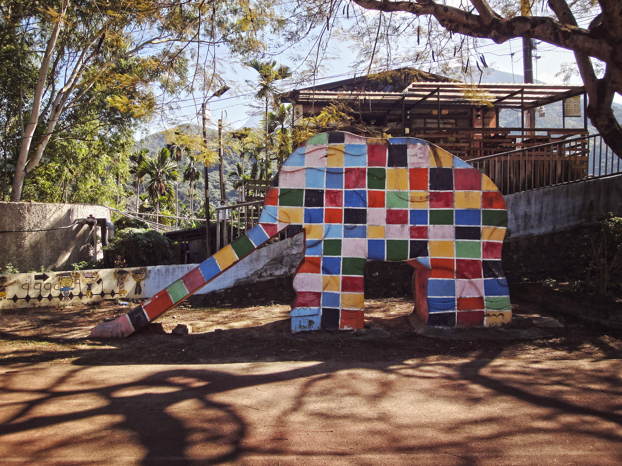
Photographer Pi Cheng Hsiu is capturing photos of vintage Taiwanese elephant slides before they slowly get replaced with more modern play structures. See them on an interactive map or on their Instagram.
Via Colossal
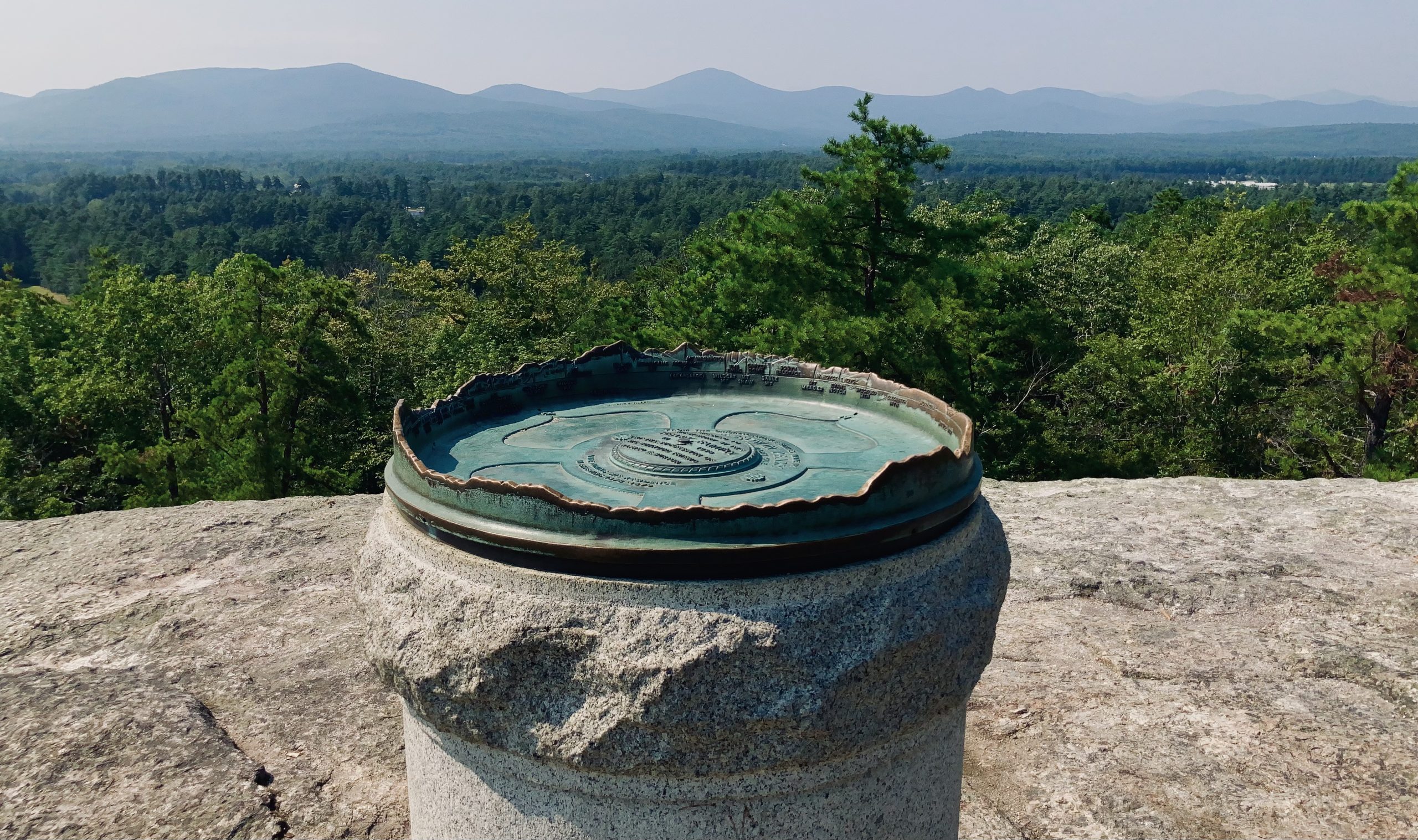
While on a very short hike during my vacation last week, I ran across a very simple, and very clever sculpture (for lack of a better word) at the top of a small hill. At first, I thought it was just a plaque on an elaborate stand, until I got closer…
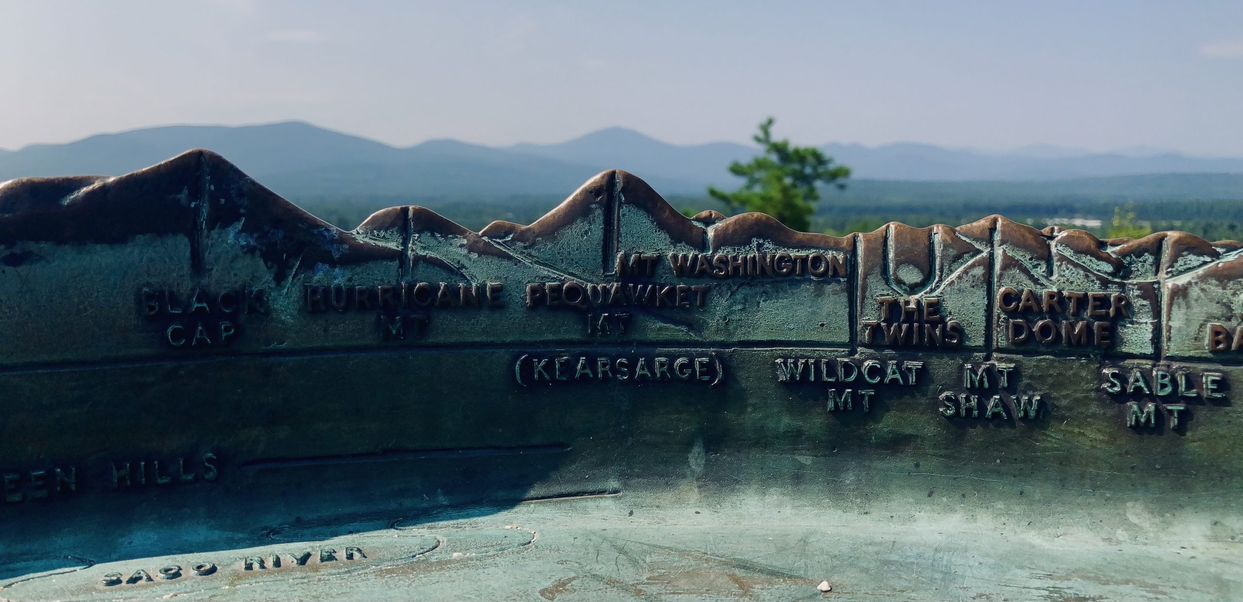
It was a map of sorts. A 3D bronze representation, erected in 1938, of all the surrounding hills and peaks (it was just foggy enough for Mount Washington to not register on camera). A very simple idea, and a good reward for a short 20-minute hike.
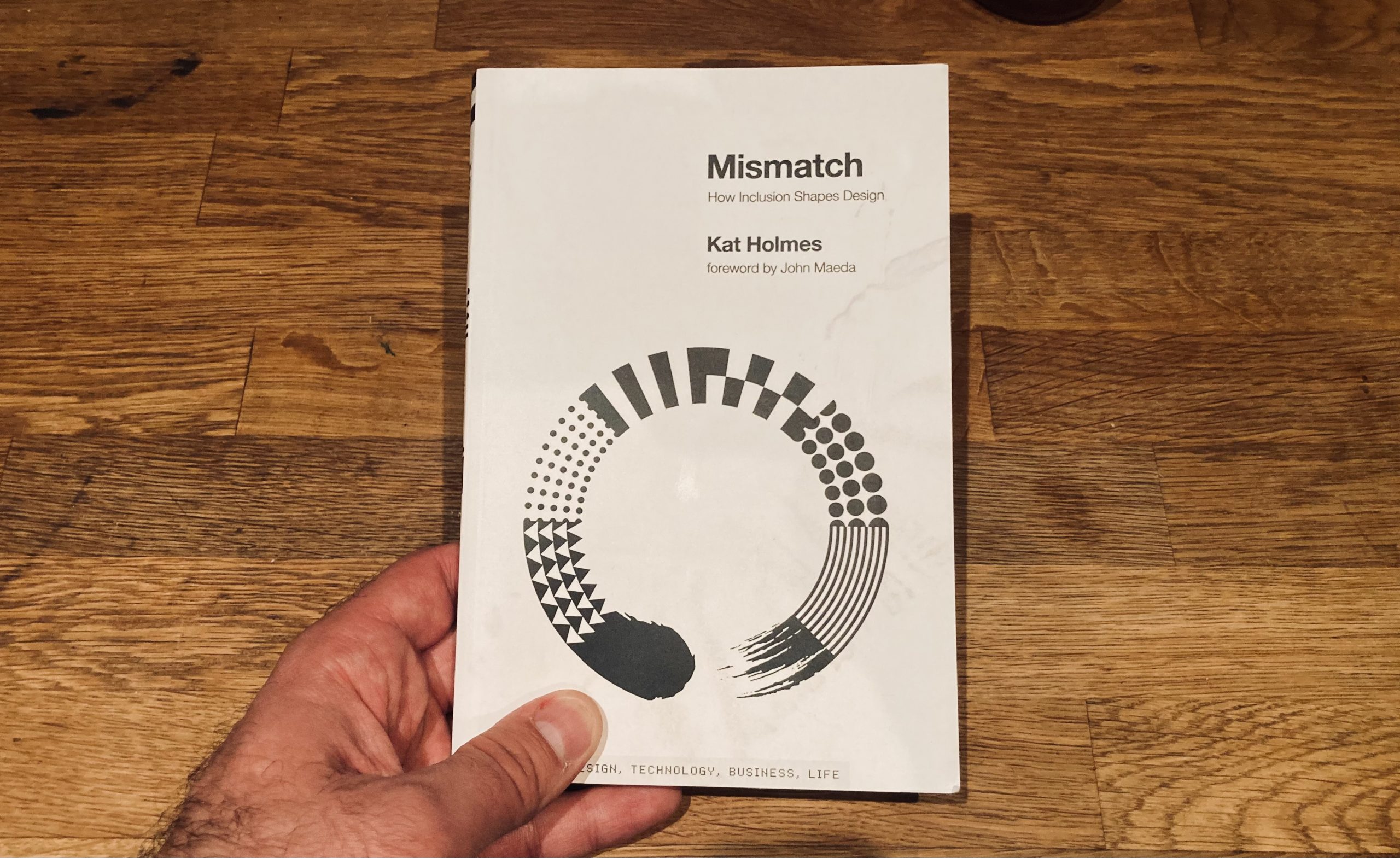
The central thesis of this book is that designers should look at disabilities not as health conditions, but instead as mismatches between the designer and those the designers are creating for. Mismatches come in a lot of forms, and can play out as physical, mental, or cultural.
A good example from early in the book deals with how men and women learn to use software in different ways. Researchers at The GenderMag identified a spectrum of ways that humans learn how to use software. One end was a guided approach, either from a human or the software itself. On the other end was to jump in and learn by trial and error. Users were interviewed and placed on this spectrum.
Writes Holmes:
The research showed that people who identified as women distributed relatively evenly across this spectrum. There was a wide range of learning styles that different women used when learning new software. People who identified as men, however, clustered heavily toward the end of the spectrum for tinkering and troubleshooting solutions.
This is an important distinction, and something that is easy to miss if there is a mismatch between software developers and the people who use our software.
One last great anecdote I wanted to share from this book that really stuck with me involves the United States Air Force research of pilot dimensions in order to better design airplane cockpits, which shows how sometimes designing for everyone can end up designing for nobody:
In the 1940s, the first fighter jets were designed to fit the average pilot. The USAF measured hundreds of bodily dimensions across thousands of pilots and used the averages of that data to design the instruments of the flight deck, or cockpit.
Every feature of that flight deck was fixed in place, without adjustability. The assumption was that any individual pilot could adjust himself to overcome the gap in reaching any element of the fight deck that wasn’t a perfect fit for him.
However, the Air Force was experiencing a high rate of crashes that couldn’t be attributed to mechanical failure or pilot error. A lieutenant and researcher, Gilbert Daniels, studied just ten of those human dimensions that were used in the design of the original fight deck. He measured four thousand pilots to confirm how many of them fit all ten dimensions.
The answer was zero.
Another abstract video made by me, in 4K without sound.
I’m on vacation for a while, and may post even less often than normal.