Daring Fireball on Microsoft's New Fonts
John Gruber of tech/Apple blog Daring Fireball has a nice rundown of Aptos, Microsoft’s upcoming default font for its Office apps.
What I find weird about the whole thing is that Microsoft still hasn’t really shown any of these new fonts. They’ve provided glimpses of them, but mostly at large display sizes, not text sizes, which is where they really matter in the context of Office documents. I’m not the only one to find this curious.
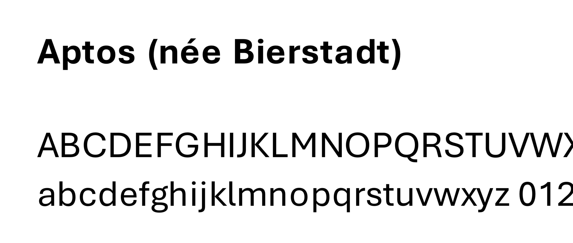
So I took matters into my own hands, and created rudimentary specimens for each of Microsoft’s five new typefaces
All are better than Arial. I don’t use office, but as Gruber says:
it’s impossible not to encounter documents created with Office, whether you personally use it or not. Thus, Microsoft’s typographic choices affect us all.