Posts Tagged ‘Design’

The Problem with Plastic

Information is Beautiful highlights this informative little infographic showing just how little of humanity’s plastic waste is actually recycled. I always knew recycling rates were small, but this chart shows just how minuscule it really is.

Link →

Daring Fireball on Microsoft's New Fonts

John Gruber of tech/Apple blog Daring Fireball has a nice rundown of Aptos, Microsoft’s upcoming default font for its Office apps.

What I find weird about the whole thing is that Microsoft still hasn’t really shown any of these new fonts. They’ve provided glimpses of them, but mostly at large display sizes, not text sizes, which is where they really matter in the context of Office documents. I’m not the only one to find this curious.

So I took matters into my own hands, and created rudimentary specimens for each of Microsoft’s five new typefaces

All are better than Arial. I don’t use office, but as Gruber says:

it’s impossible not to encounter documents created with Office, whether you personally use it or not. Thus, Microsoft’s typographic choices affect us all.

Read More →

The Impossible Map by Evelyn Lambart

For the second day in a row I’m posting an old favourite by NFB legend Evelyn Lambart. This time it’s The Impossible Map, one of my favourite explanations of how map projections work using fruit and vegetables. Simple but effective.

The Sublime Title Screens of Evelyn Lambart

Canada’s National Film Board has helped create many wonderful films over its long history. In 2020 I hosted an event in collaboration with the NFB to show films and host a discussion about legendary animator Norman McLaren. I want to talk about one of his frequent collaborators, Evelyn Lambart. Specifically, I want to highlight her tremendous title cards and wonderful lettering.

The bulk of her films were created using stop motion of paper cut outs, laid out on a black table and filmed from the top. Her title cards were absolutely gorgeous—colourful, playful. Each title links to the films, which are mostly beautifully rendered versions of simple folk songs or fairy tales.

Lambart was born in Ottawa in 1914, and was active making films with the NFB from 1943 until 1977. Each of these title cards links to versions of the films you can watch for free.

Book: Symbol Sourcebook

This book, assembled by Henry Dreyfuss and team for original publishing in 1972, is a really great design resource. It’s a fairly exhaustive collection of different visual symbols used in all sorts of industries. Think of it as a sort of Noun Project but in book form.

As well as being a reference for everything from nautical flags to hobo symbols, it also recounts how some symbols have changed over the years, such as this excellent grid of evolving Olympic symbols:

The back of the book contains a wonderful index of symbols from all sources organized by rough shape:

But perhaps my favourite part of the edition I bought is the exuberant introduction by one Buckminster Fuller, which he concludes with:

Henry Dreyfuss’ contribution to a new world technique of communication will catalyze a world preoccupation with its progressive evolution into a worldian language so powerfully generalizes as to swiftly throw into obsolescence the almost fatally lethal trends of humanity’s age-long entrapment in specializations and the limitations that specialization imposes upon human thinking. Thus humans can be liberated to use their own cosmically powerful faculties to communicate what needs to be done in local Universe, as humans are uniquely capable of doing – and uniquely advantaged to do – by the phenomenon love and the truthfully thinking mind.

Purchase Here →

On Buckminster Fuller's Exuberance

As I touched on in my post about Henry Dreyfuss’ Symbol Sourcebook, Buckminster Fuller, the designer of the above-pictured Expo 67 American Pavilion here in Montréal, was a big character. I recently ran into the following passages about him in a thrifted book This Was Expo, about Montréal’s Expo 67:

He once had an idea for an apartment building that would be put in its place by a dirigible. The building would be made of lightweight alloys and the floors of it would be hung from a great mast. A dirigible would pick up the whole building and take it to where it was needed. First the dirigible would drop a bomb – that’s right, a bomb – which would create a hole in the ground for the mast. Then the dirigible would put the building in place and fly away. A ground crew would pour concrete around the mast to secure it. And everybody’s housing problem would be solved.

This is someone who does not shy away from big ideas. It continues later:

On this day he was talking, as usual, about his ideas and about the future of mankind. “Because I’m in research,” he was saying, “I’m on the frontiers of man.” He looked around at the fair outside, through the transparent walls of the dome. “We are all going into world man,” he said. And for a moment, under the spell of his genial intensity, Expo seemed an important moment in world history and “world man” indeed a possibility. But then perhaps all moments seem important to those in Bucky Fuller’s company.

In a 1972 interview, Bucky allegedly said:

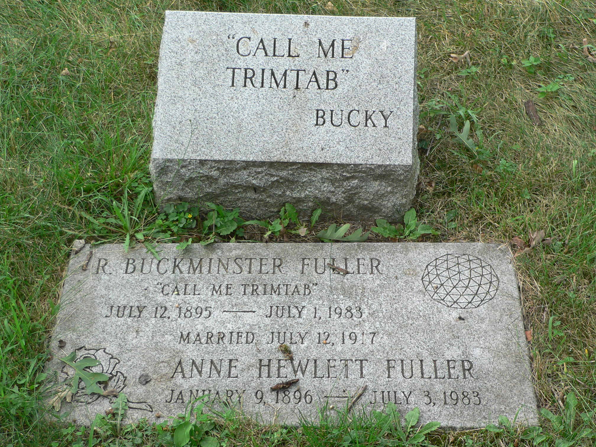
Something hit me very hard once, thinking about what one little man could do. Think of the Queen Elizabeth again: The whole ship goes by and then comes the rudder. And there’s a tiny thing on the edge of the rudder called a trim tab. It’s a miniature rudder. Just moving that little trim tab builds a low pressure that pulls the rudder around. It takes almost no effort at all. So I said that the individual can be a trim tab. Society thinks it’s going right by you, that it’s left you altogether. But if you’re doing dynamic things mentally, the fact is that you can just put your foot out like that and the whole ship of state is going to turn around. So I said, ‘Call me Trim Tab.’

And he believed in this small idea of leverage enough that he put it on his tombstone.

Photo: Wikipedia

The Portal Illusion

This illusion is simple but satisfying.

View on YouTube →

Book: The Japanese House

Every so often you run into a book about a topic you know next to nothing about, and it practically jumps off the shelf and into your life. The Japanese House is such a book. It recounts in great detail all the design elements of a traditional Japanese house, including layout, gardens, and the particular art of screening things from view, as recounted in the following excerpt:

Your first experience with the Japanese art of screening is likely to occur as you approach a building. Here, in the entry courtyard of Isecho in Kyoto, Your approach is indirect. As you pass the main gate, you know the entry must be behind the small garden, but you have to go around it to be sure-and the circular form invites you to go around. Thus, even before you are in Side the building, you find you have participated in an aesthetic experience.

This is obviously not a readily available book, but it is available at the Internet Archive.

Experience Mapping at Cooper Hewitt

On my recent trip to New York City I was lucky enough to visit the Cooper Hewitt design museum, a favourite place in the big apple. There I found this one hands-on strategy of getting kids to map their emotional experience of the museum using coloured markers.

From their accompanying text:

On this wall, students share their field trip experiences by choosing a ribbon color representing their felt emotion and placing that ribbon in their borough location. Students are mapping their “data”-emotions represented by ribbons-to NYC’s five boroughs.

As the school year progresses, this wall will tell the ongoing story of what our K-12 community members from around the city experience when visiting Cooper Hewitt’s galleries.

Parall(elles) A History of Women in Design at Musée des Beaux-Arts Montréal

As is my custom these past couple weeks, I went to see a design exhibit in the last few days of its run. The previous was W.E.B. Dubois at The Cooper Hewitt in New York City. This time it was a women in design exhibit at Montréal’s Musée des Beaux Arts—Parall(Elles).

Organized in collaboration with the Stewart Program for Modern Design, this major exhibition celebrates the instrumental role women have played in the world of design through a rich corpus of art works and objects dating from the mid-19th century onwards. In addition, it examines the reasons why women are underrepresented in the history of this discipline and encourages an expanded understanding of what constitutes design.


Chaise Sauvage by Jay Sae Jung Oh


Exploded Chair by Joyce Lin

On until May 28, 2023.